How to Use Color Psychology to Revamp Your Living Space
Color isn’t just about aesthetics; it has the power to influence mood, emotions, and even behavior. Color psychology explores how different hues can create calming, energizing, or inspiring environments. Whether you want to create a cozy retreat or an uplifting workspace, understanding color psychology can help you design a space that truly reflects your style and meets your emotional needs.
This guide will show you how to harness the power of color to transform your living space, from selecting the right palette to practical tips for applying it effectively.
1. The Basics of Color Psychology
Color psychology is based on the idea that colors evoke emotional responses. Warm colors like red, orange, and yellow tend to be stimulating, while cool colors like blue, green, and purple promote relaxation and calmness.
Key Categories:
- Warm Colors: Energizing, passionate, and lively.
- Cool Colors: Calming, soothing, and peaceful.
- Neutral Colors: Versatile, grounding, and timeless.
2. Choosing the Right Colors for Each Room
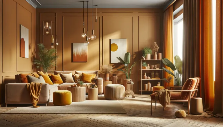
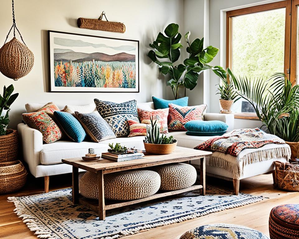
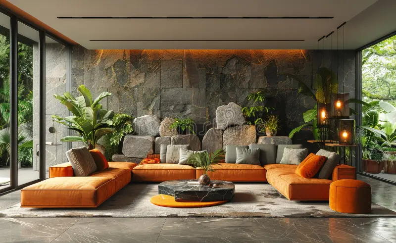
Living Room: Warmth & Connection
The living room is where people gather, so choose colors that foster warmth and togetherness:
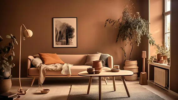
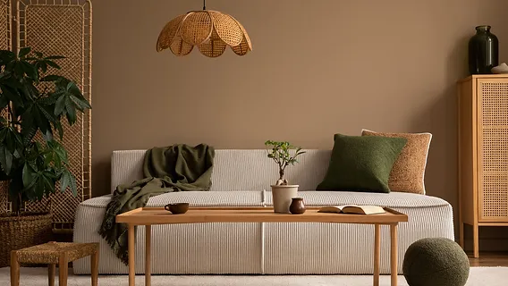
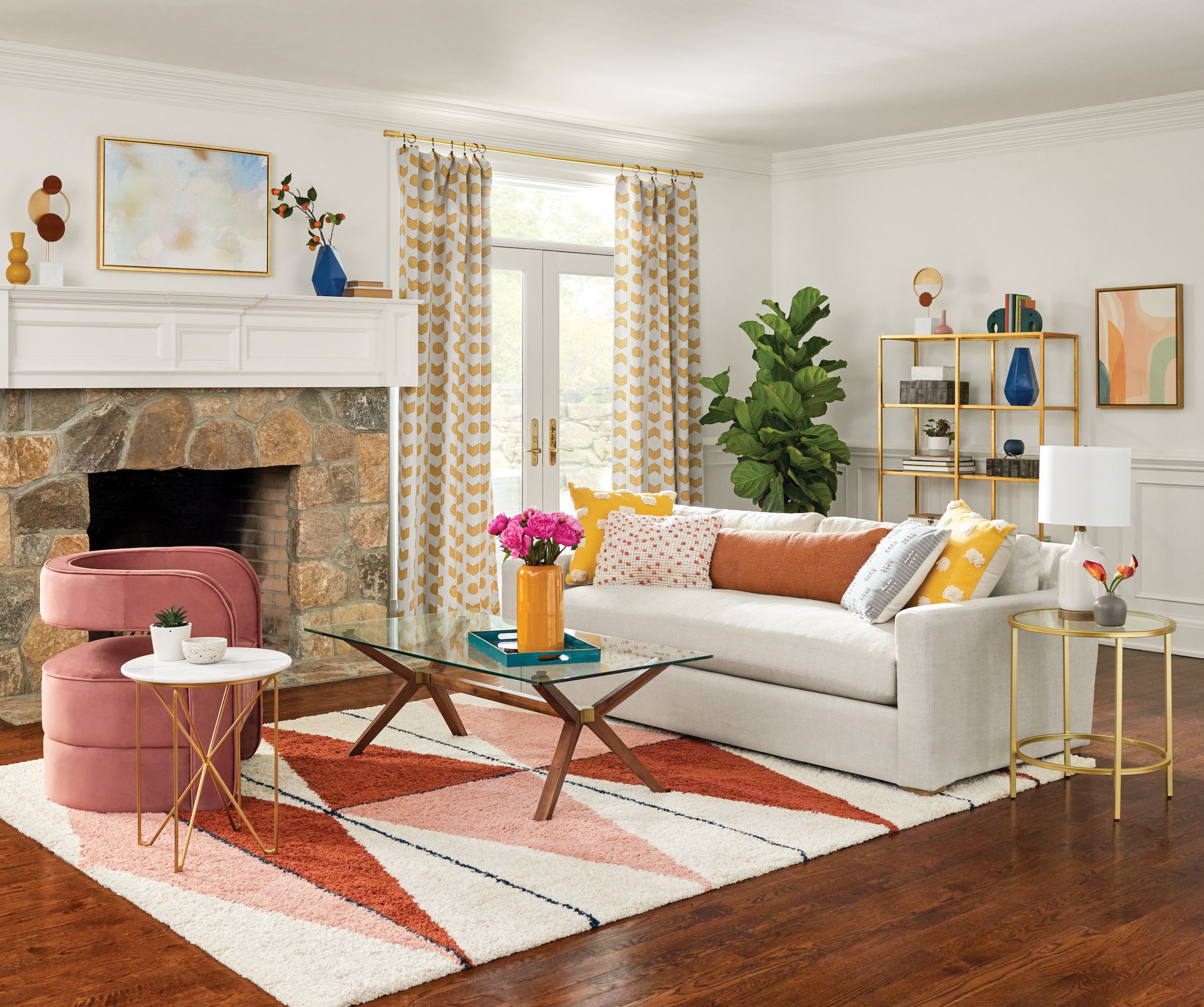
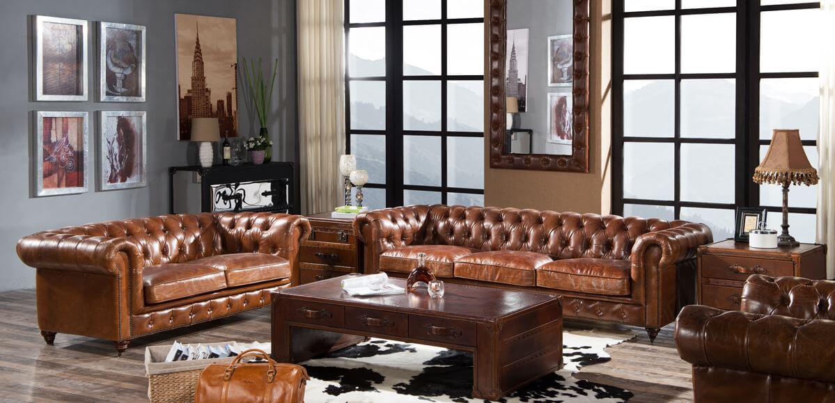
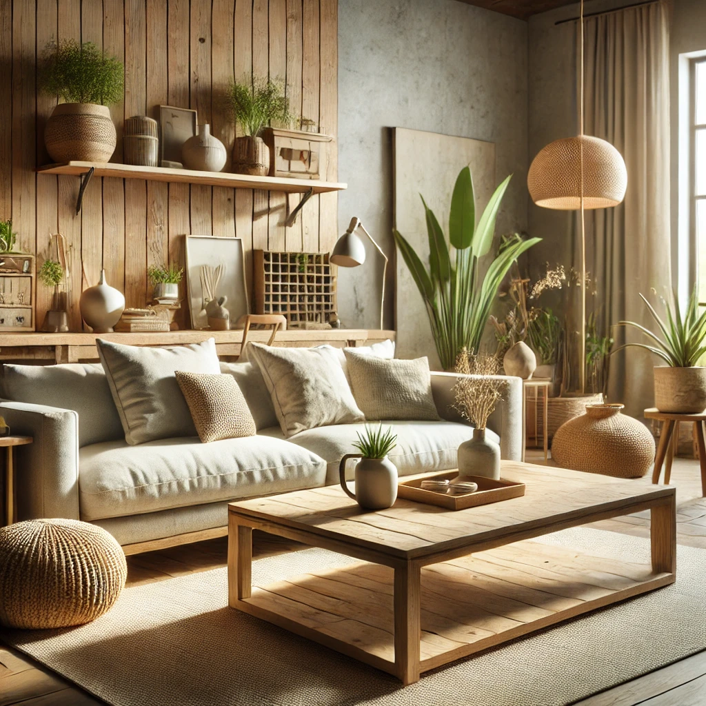
- Earthy tones (beige, taupe, terracotta) create a welcoming vibe.
- Soft yellows add cheerfulness without overwhelming the space.
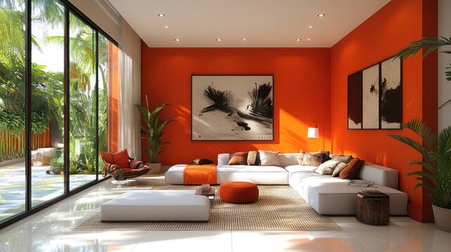
- Pops of red or orange can stimulate conversation and energy.
Tip: Balance bold colors with neutral furniture to avoid visual overload.
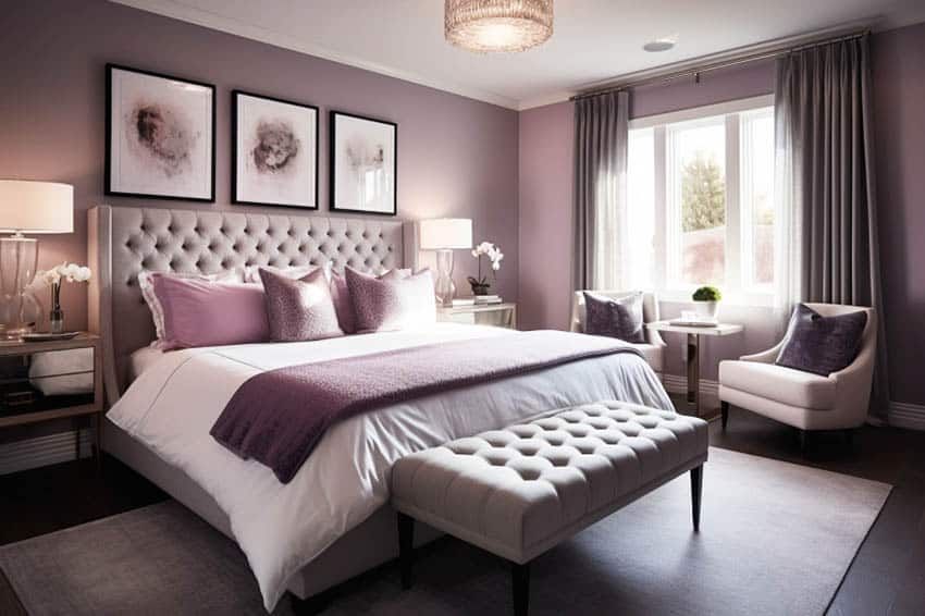
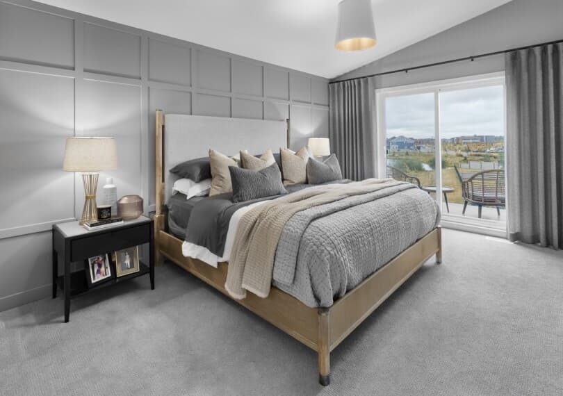
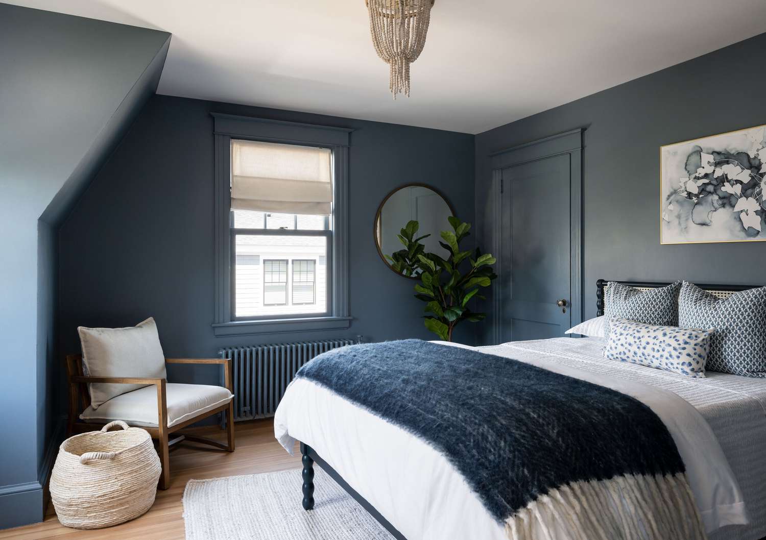
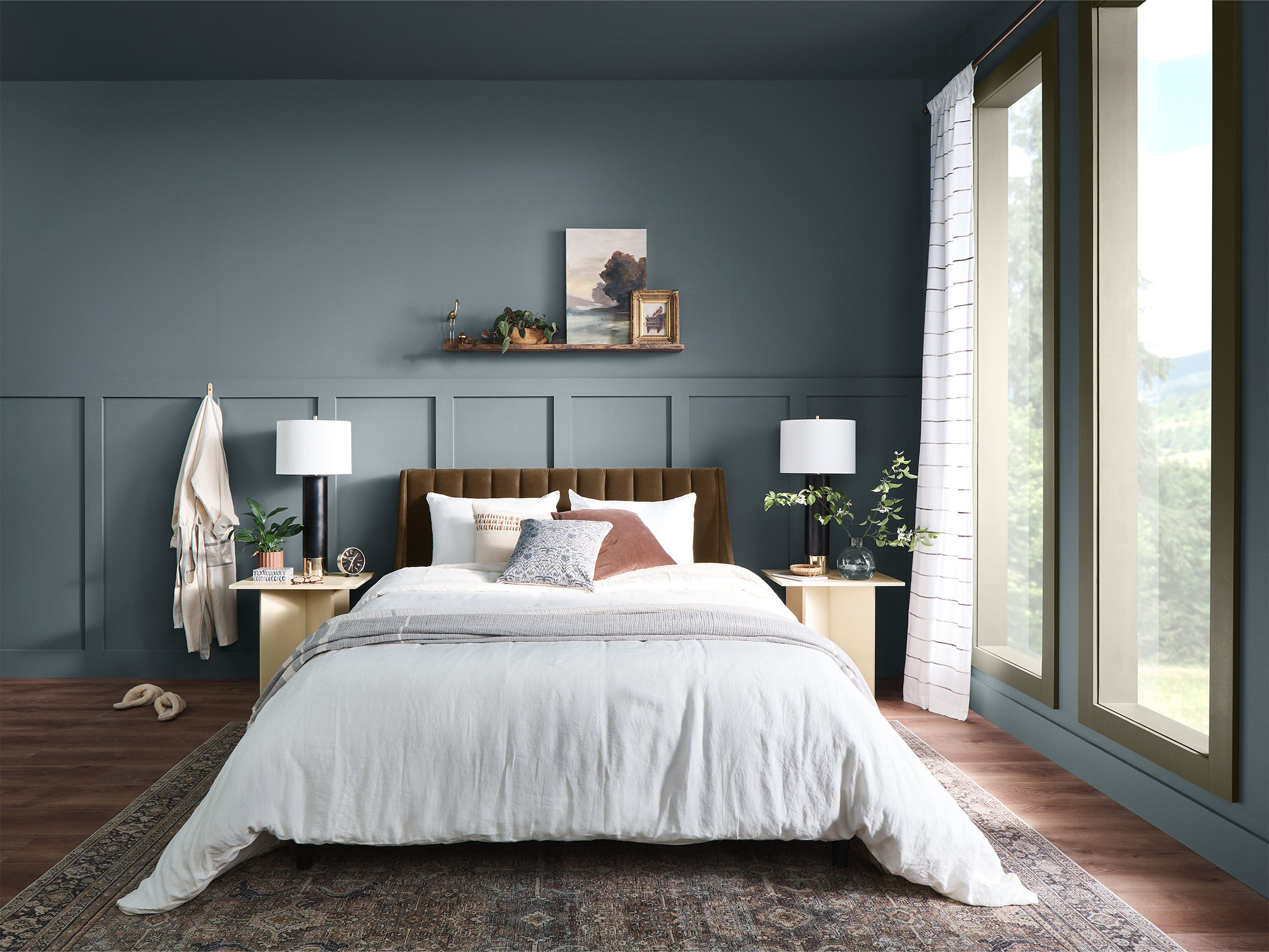
Bedroom: Calm & Serenity
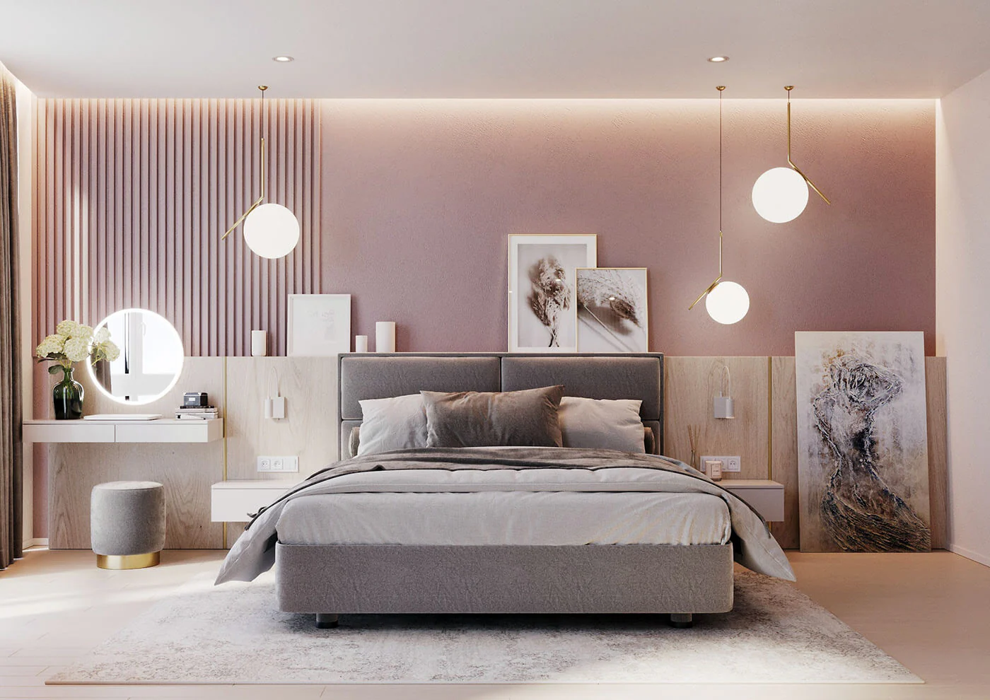
The bedroom should be a sanctuary, promoting rest and relaxation:
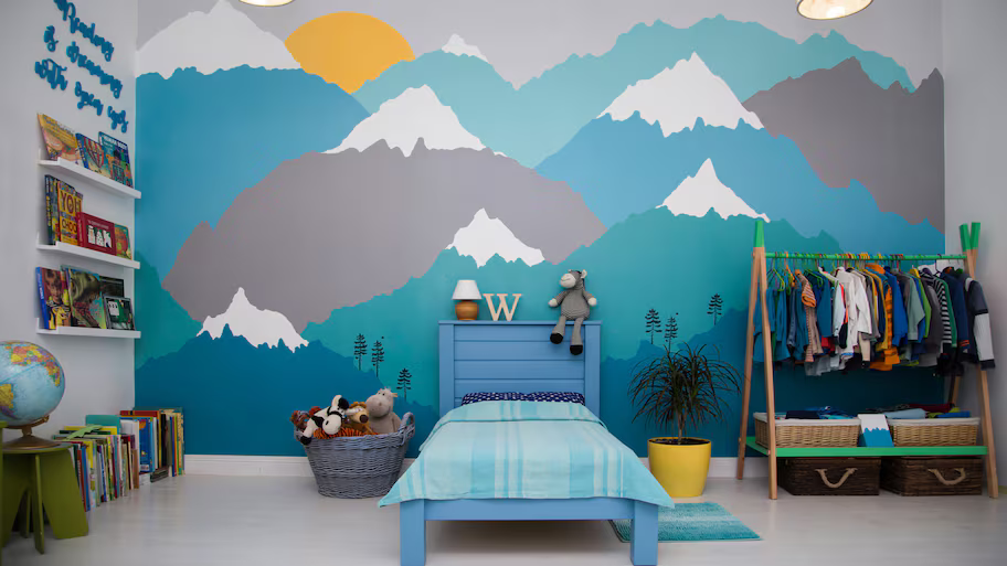
- Blues evoke tranquility and reduce stress.
- Lavender adds a subtle, calming effect.
- Cool grays create a peaceful, minimalist backdrop.
Design Hack: Use darker shades for accent walls and lighter hues for bedding to create depth.
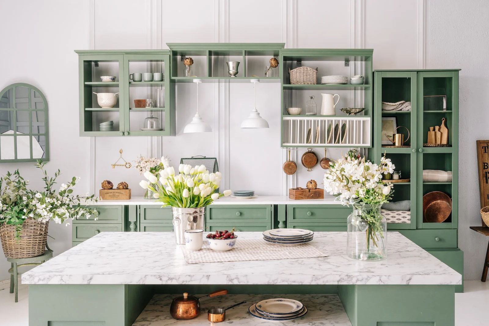
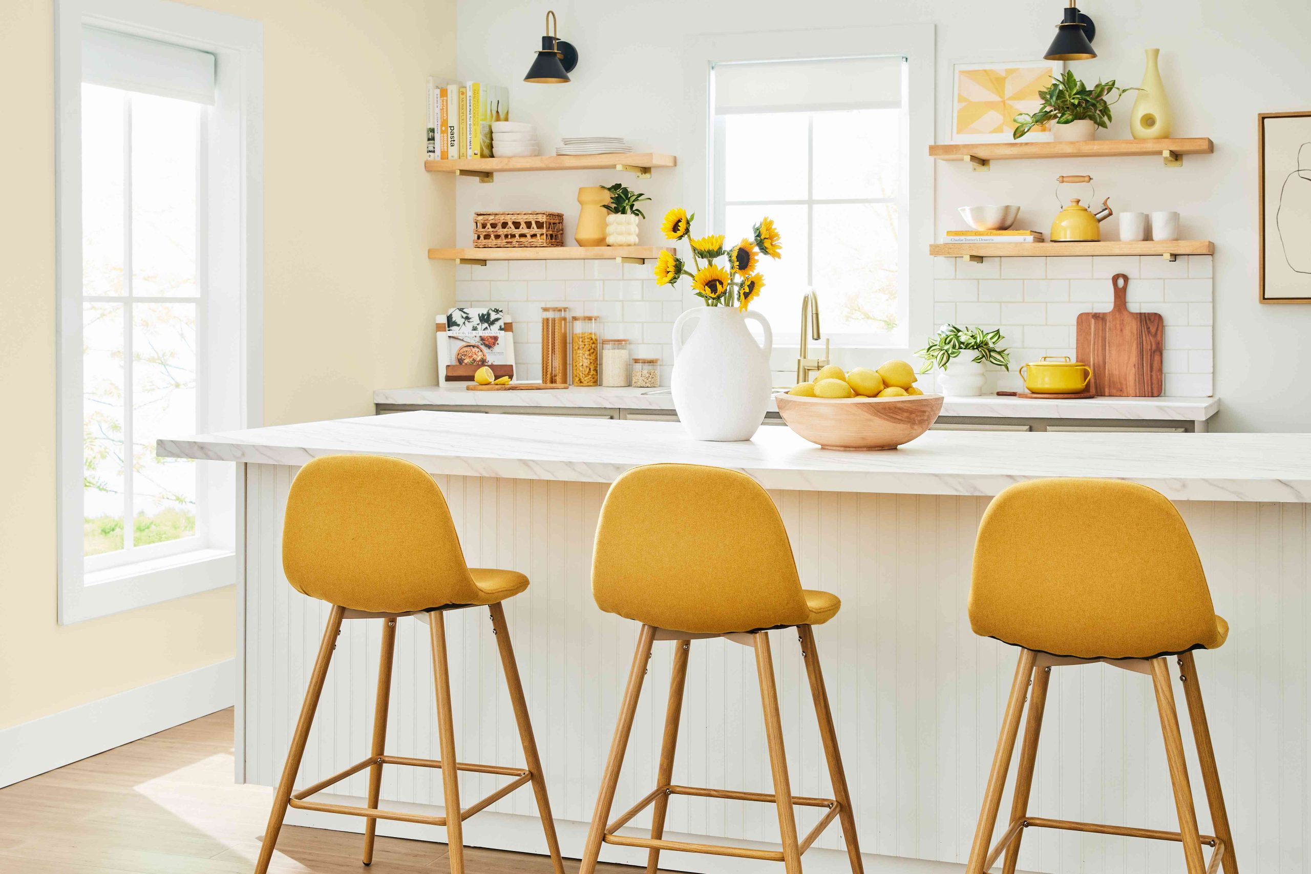
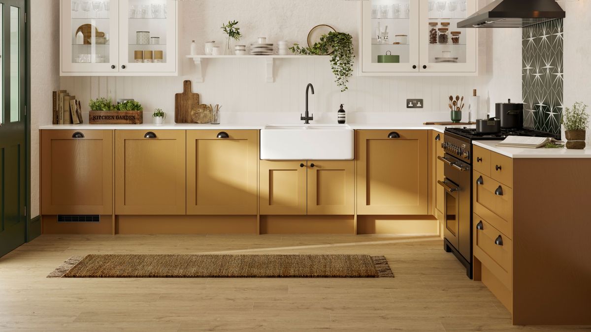
Kitchen: Energy & Creativity
Kitchens thrive on energy and creativity:
- Yellow stimulates appetite and radiates warmth.
- Green symbolizes freshness and health.
- Warm neutrals like cream or soft beige provide balance.
Pro Tip: Use bold colors on backsplashes or bar stools for an easy, dynamic update.
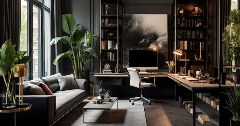
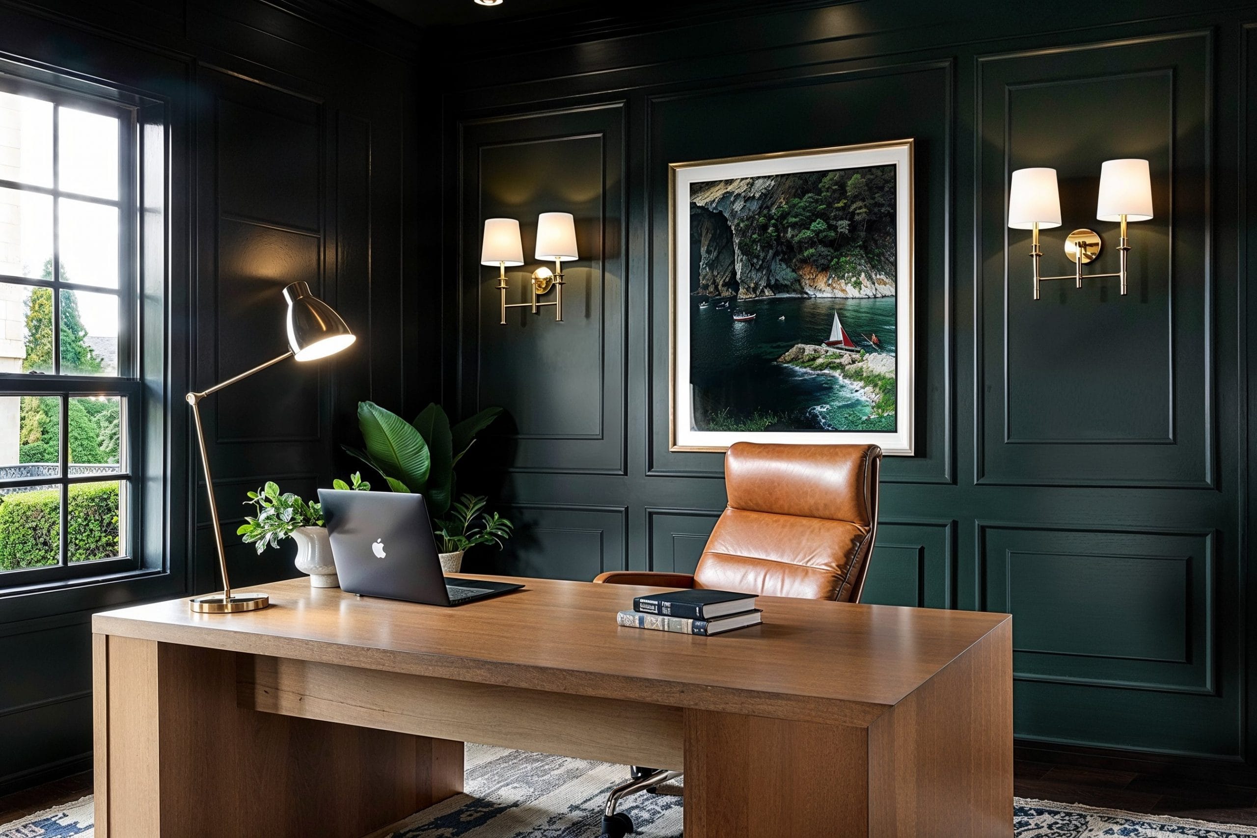
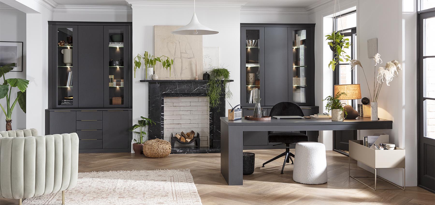
Home Office: Focus & Productivity
Your workspace should promote concentration and reduce stress:
- Green improves focus and reduces eye strain.
- Blue enhances productivity and a sense of calm.
- Natural tones like wood and beige create a grounding effect.
Tip: Add plants for a pop of green and an extra productivity boost.
3. Accent Colors: Small Changes, Big Impact
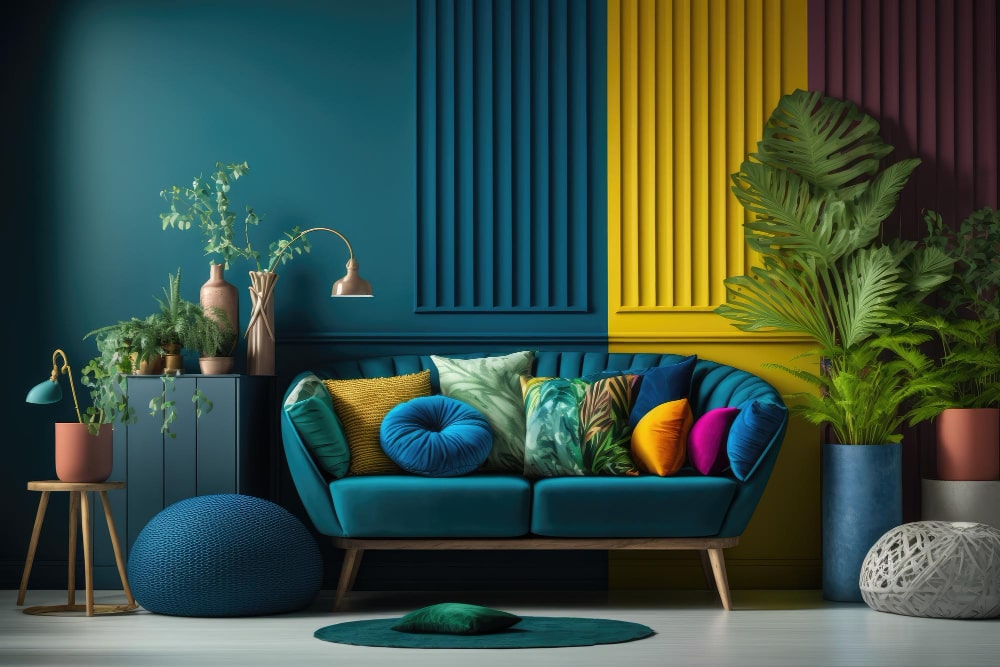
You don’t have to repaint an entire room to feel the impact of color. Accent colors can transform a space subtly yet effectively:
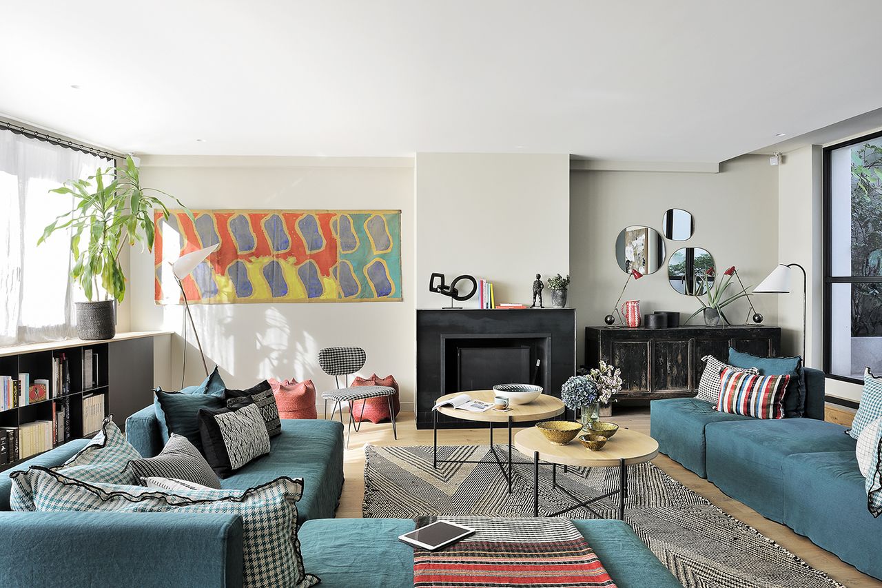
- Use throw pillows, rugs, and curtains for easy updates.
- Add bold artwork or colorful vases to liven up neutral spaces.
- Experiment with painted furniture or a single accent wall.
Quick Tip: Stick to the 60-30-10 rule: 60% dominant color, 30% secondary color, 10% accent color.
4. Color Combinations That Work
Finding the right color combinations is key to a cohesive look:
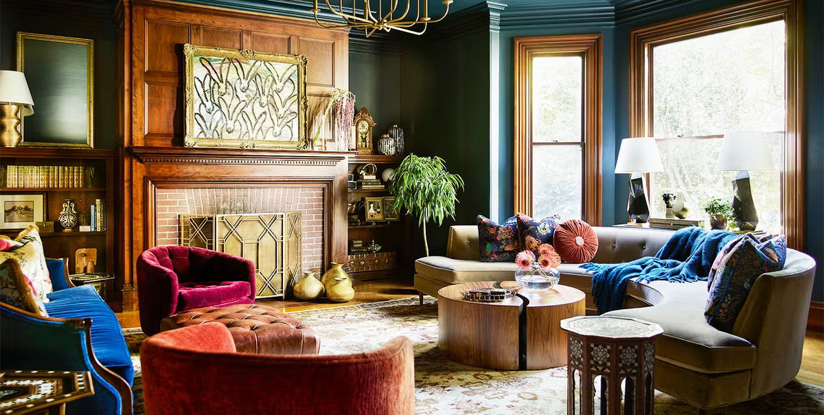
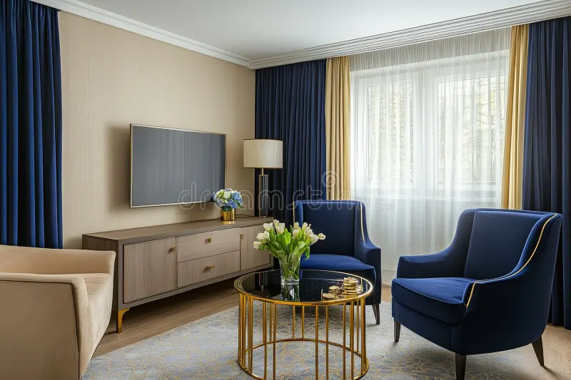
- Navy & Gold: Sophisticated and luxurious.
- Blush & Gray: Soft, romantic, and modern.
- Green & White: Fresh, clean, and vibrant.
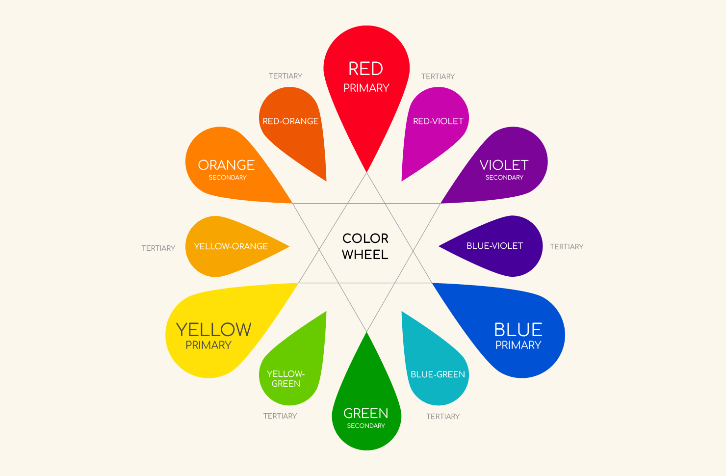
Tip: Use the color wheel to find complementary or analogous color schemes.
5. The Psychology Behind Popular Colors
- Red: Passion, energy, excitement (use sparingly).
- Orange: Warmth, creativity, enthusiasm.
- Yellow: Happiness, optimism, friendliness.
- Green: Balance, harmony, growth.
- Blue: Calmness, trust, productivity.
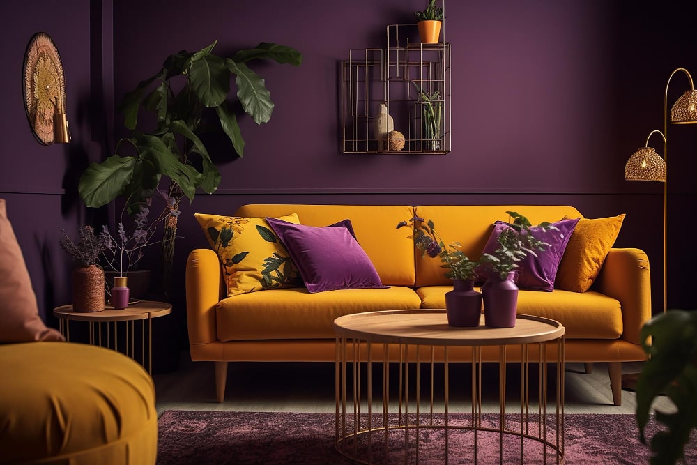
- Purple: Luxury, creativity, spirituality.
- Neutral tones: Versatility, balance, and grounding.
Note: The same color can feel different depending on the shade and lighting.
Final Thoughts
Understanding color psychology empowers you to design spaces that aren’t just visually appealing but also emotionally supportive. Whether you’re adding a bold accent wall or subtle decor touches, color can transform how you feel in your home.
What colors are you excited to experiment with in your living space?
editor's pick
news via inbox
Nulla turp dis cursus. Integer liberos euismod pretium faucibua

